
Due to site maintenance, Forum interaction has been disabled until August 13. For support, please search existing forum posts or check the support page.
Improve readability of top panel (and some map UX suggestions)
Quote from PhilipMat on May 13, 2021, 10:46I've had Scenic on my phone for a while, but only got to try it this past weekend. Thank you for giving me some wonderful roads to go down on.
I have a few suggestions to make base on using the app on a big bike and in bright sun (helmet with a tinted visor).
I broke the list by section and further tried breaking into individual items -- sorry if this resulted in a list too long.A. Readability of Top Panel
In short, I found this on occasion difficult to read, in particular the street name. Frequently I had to switch off the tinted visor and move as close as I could to the phone to read it.
A.1 - Improve contrast of Top Panel, in particular the street name
I believe that black text on white background provides less contrast, particularly in bright light. Because the phone emits lights, the white panel effectively "swallows" the thinner black letters.
I didn't have issues with the miles-to-turn, because that is both larger and much bolder.
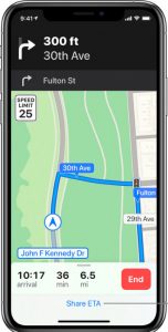
Both Apple Maps and Google Maps use white text on dark background (black for Apple , dark green for Google) and also slightly larger fonts, increasing the readability of the street names. I used all three in succession and I never had issues reading the street names in both of those apps.
In looking at the screenshot from scenic I posted above, perhaps the panel can be increased to take over the sliver of blue sky at the top of the map, which otherwise provides no aid or function in navigation, and thus allow for bigger (and bolder) fonts.
A2. Non-standard street names
This may be due to the data that Scenic relies on and it may be a regional thing (Texas), but on a few routes Scenic displayed the street names in a fashion that, when combined with the readability issues of A1, made it difficult to understand (wrapping to show as it was on screen):
FM1718 Farm to Market
Rd 1718FM1718 is almost always written as either FM-1718 or FM 1718.; it's almost never spelled out as "Farm to Market", save for in speech.
That extra space between FM and the number would have made a difference (against the background of A1); the extra spelling increased the confusion.A3. Street with no names
On several occasions no names were shown in the panel, though the arrow and the miles-to-turn were accurate.
In some cases it was a road; in some cases it was a very long private driveway (and gated at the turn).
This was in "Curvy" mode - perhaps a setting can be added to avoid routing down streets with no names.A4. More contrast in the
top-righttop-left indicatorThe dimmed section (road fork) of the turn indicator in the
top righttop left should be even dimmer. In bright sun with a tinted visor it became on occasion difficult to tell which direction I was supposed to turn.
B. Issues in the Map Area
Minor issues:
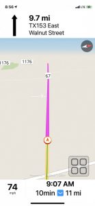
- Magenta (for route) on light-colored map is not very visible. I learned eventually it can be changed; I want to suggest that the default color should be something that provides better contrast;
- The "Route to here?" popup that appears after selecting a destination has too small buttons and are difficult to select with gloved hands. I don't know if the No option even makes sense: if routing to that point is not desired, one can simply go back to the search -- maybe this would allow for a larger Yes button.
- Cache searches until a route is started. If the location of a search does not appear to be correct, one cannot go back to the destination search screen and select another entry -- the search has be restarted again, and in some cases the input string is fairly long to type.
B4. Route and turn zooming in 2D
The zoom out level makes the 2D setting difficult to use. For one, it's not zoomed out enough when there is a good distance to the next turn; I had to switch to 3D to get a better picture.
Worse -- I could be wrong -- it zooms in too aggressively in 2D when a turn is coming. On a few occasions the turn simply showed up on a the screen with little time, forcing me to constantly check the map to make sure I can see which road I was supposed to turn on.I think that the was Scenic should zoom (and how the other apps do it) is so that the turn should always be visible; the actual zoom process should not start until the turn appeared at the top of the screen and it should always keep the turn on the screen (effectively the zoom point should be the turn).
Perhaps this is something I can tweak in the Settings, though it wasn't clear to me where and how. I had to simply go back to 3D because I had missed too many turns in 2D.
B5. Show more of the route in 3D; don't add the fake sky
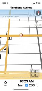
I suspect that this can be controlled by the camera angle in settings, but Scenic simply wastes too much of the screen in its default mode. To make matter worse, the fake sky effect is present even when none of the sky is visible anyway. Here is the map at 5 degree camera angle:
B6. Switch from 3D to 2D on turns
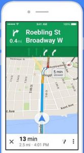
2D mode offers more information that 3D; 3D is better for overview. Apple Maps at least switches from 3D routing into 2D routing at turns; Google Maps adjusts the map angle so that you get a more overhead view (not fully 2D, but close).
This would be in particular useful at complex intersections and round-abouts.
C. Settings
C1. Is there a way to turn Voice Instructions off?
Before I start every ride I am prompted if I wanted to use Voice Instructions. I choose "Continue Without Voice". If this is to create an incentive to buy Premium, I'm perfectly fine with that. If not, could we please add a way to disable voice instructions for the entire app rather than on a per-route basis? There's already a button in the popup settings pane to enable voice and counter this setting, if added.
C2. Speed Limit indicator - show when speed limit is known
With "Show Speed Limit" set to "Alwasy", the top speed indicator displayed "--" for most of the roads I've been down on. I understand if Scenic doesn't have this information, but I'm thinking the "Always" option should really be "Always (when known)". I ended up switching to "When Speeding' and it went away for most of the trip, because of the lack of information issue.
I don't think anybody relies on "When Speeding" to be warned they're actually speeding, but if anybody does it might come to them as a surprise if they were found to be speeding and there was no "warning" from Scenic.
Sorry if this has been long. I wrote this much because I loved using Scenic when I could and I'd like to see it improved and become my go-to mapping app.
I've had Scenic on my phone for a while, but only got to try it this past weekend. Thank you for giving me some wonderful roads to go down on.
I have a few suggestions to make base on using the app on a big bike and in bright sun (helmet with a tinted visor).
I broke the list by section and further tried breaking into individual items -- sorry if this resulted in a list too long.
A. Readability of Top Panel
In short, I found this on occasion difficult to read, in particular the street name. Frequently I had to switch off the tinted visor and move as close as I could to the phone to read it.
A.1 - Improve contrast of Top Panel, in particular the street name
I believe that black text on white background provides less contrast, particularly in bright light. Because the phone emits lights, the white panel effectively "swallows" the thinner black letters.
I didn't have issues with the miles-to-turn, because that is both larger and much bolder.
Both Apple Maps and Google Maps use white text on dark background (black for Apple , dark green for Google) and also slightly larger fonts, increasing the readability of the street names. I used all three in succession and I never had issues reading the street names in both of those apps.
In looking at the screenshot from scenic I posted above, perhaps the panel can be increased to take over the sliver of blue sky at the top of the map, which otherwise provides no aid or function in navigation, and thus allow for bigger (and bolder) fonts.
A2. Non-standard street names
This may be due to the data that Scenic relies on and it may be a regional thing (Texas), but on a few routes Scenic displayed the street names in a fashion that, when combined with the readability issues of A1, made it difficult to understand (wrapping to show as it was on screen):
FM1718 Farm to Market
Rd 1718
FM1718 is almost always written as either FM-1718 or FM 1718.; it's almost never spelled out as "Farm to Market", save for in speech.
That extra space between FM and the number would have made a difference (against the background of A1); the extra spelling increased the confusion.
A3. Street with no names
On several occasions no names were shown in the panel, though the arrow and the miles-to-turn were accurate.
In some cases it was a road; in some cases it was a very long private driveway (and gated at the turn).
This was in "Curvy" mode - perhaps a setting can be added to avoid routing down streets with no names.
A4. More contrast in the top-right top-left indicator
The dimmed section (road fork) of the turn indicator in the top right top left should be even dimmer. In bright sun with a tinted visor it became on occasion difficult to tell which direction I was supposed to turn.
B. Issues in the Map Area
Minor issues:
- Magenta (for route) on light-colored map is not very visible. I learned eventually it can be changed; I want to suggest that the default color should be something that provides better contrast;
- The "Route to here?" popup that appears after selecting a destination has too small buttons and are difficult to select with gloved hands. I don't know if the No option even makes sense: if routing to that point is not desired, one can simply go back to the search -- maybe this would allow for a larger Yes button.
- Cache searches until a route is started. If the location of a search does not appear to be correct, one cannot go back to the destination search screen and select another entry -- the search has be restarted again, and in some cases the input string is fairly long to type.
B4. Route and turn zooming in 2D
The zoom out level makes the 2D setting difficult to use. For one, it's not zoomed out enough when there is a good distance to the next turn; I had to switch to 3D to get a better picture.
Worse -- I could be wrong -- it zooms in too aggressively in 2D when a turn is coming. On a few occasions the turn simply showed up on a the screen with little time, forcing me to constantly check the map to make sure I can see which road I was supposed to turn on.
I think that the was Scenic should zoom (and how the other apps do it) is so that the turn should always be visible; the actual zoom process should not start until the turn appeared at the top of the screen and it should always keep the turn on the screen (effectively the zoom point should be the turn).
Perhaps this is something I can tweak in the Settings, though it wasn't clear to me where and how. I had to simply go back to 3D because I had missed too many turns in 2D.
B5. Show more of the route in 3D; don't add the fake sky
I suspect that this can be controlled by the camera angle in settings, but Scenic simply wastes too much of the screen in its default mode. To make matter worse, the fake sky effect is present even when none of the sky is visible anyway. Here is the map at 5 degree camera angle:
B6. Switch from 3D to 2D on turns
2D mode offers more information that 3D; 3D is better for overview. Apple Maps at least switches from 3D routing into 2D routing at turns; Google Maps adjusts the map angle so that you get a more overhead view (not fully 2D, but close).
This would be in particular useful at complex intersections and round-abouts.
C. Settings
C1. Is there a way to turn Voice Instructions off?
Before I start every ride I am prompted if I wanted to use Voice Instructions. I choose "Continue Without Voice". If this is to create an incentive to buy Premium, I'm perfectly fine with that. If not, could we please add a way to disable voice instructions for the entire app rather than on a per-route basis? There's already a button in the popup settings pane to enable voice and counter this setting, if added.
C2. Speed Limit indicator - show when speed limit is known
With "Show Speed Limit" set to "Alwasy", the top speed indicator displayed "--" for most of the roads I've been down on. I understand if Scenic doesn't have this information, but I'm thinking the "Always" option should really be "Always (when known)". I ended up switching to "When Speeding' and it went away for most of the trip, because of the lack of information issue.
I don't think anybody relies on "When Speeding" to be warned they're actually speeding, but if anybody does it might come to them as a surprise if they were found to be speeding and there was no "warning" from Scenic.
Sorry if this has been long. I wrote this much because I loved using Scenic when I could and I'd like to see it improved and become my go-to mapping app.
Quote from Guido on May 13, 2021, 11:32Hi Philip,
Thanks for the extended feedback. Really appreciate you taking the time. Before I get started with my detailed response, I am working on Scenic 3 at the moment. In Scenic 3 I'm switching to a new map provider. I will refer to this in my detailed comments below.
Thanks again and best regards,
GuidoA1 - I've tried to find a good balance between font size and showing enough of the name on the screen. With devices of different sizes this is difficult. I believe it's also personal. For example, I find Google's white on green very difficult to read. Scenic does have a dark mode (Settings -> Appearance). Perhaps that could be a solution for you for the moment? (It does change the whole interface to dark mode though). I will see what I can do to make this more configurable in Scenic 3.
A2 & A3 - I believe this will improve with the new map provider in Scenic 3.
A4 - I'm assuming you mean top-left, correct? The arrow image with conceptual drawing of junction coming up. Also this will change with the new map provider.
B1 - you can change the route color in Settings > Light mode settings / Settings > Dark mode settings
B2 - will be bigger in Scenic 3
B3 - Scenic 3 will have the option to show search results not only in a list, but also on the map. That should make it easier to choose the right result the first time. I like your suggestion of cashing the results too and will add that to the list.
B4 - You can change auto-zoom behaviour (Settings > Navigation & Tracking > Auto Zoom). Furthermore, auto zoom will be revised in Scenic 3. It will still be speed based though. Perhaps I will add a 'distance to turn' based zoom later, but that has its own problems. Main stream nav apps like Waze use a combination between speed based and distance to turn based, but it takes time and a lot of testing to reverse engineer. Over the years with different feedback regarding zoom I found this is also highly personal so... hard to get it right for the majority, without offering too much configuration options that confuse people 🙂.
B5 - Scenic 3 will have no more fake sky
C1 - Well, I will admit, it's a bit of incentive to get premium, but also the people who use Scenic with 'pay as you go' (with credits) sometimes want voice guidance and sometimes don't. This will be revised a little bit in Scenic 3 as well (see the Scenic 3 link I mentioned at the top)
C2 - Scenic 3's map provider has much more reliable and more complete max speed info. I have a bit of different opinion on this though. When you see '--' then at least you know that Scenic doesn't know and you should look for a road sign. If Scenic doesn't show the max speed 'road sign' when it doesn't know speed limit, then you might think you are not speeding, while maybe you are.
Hi Philip,
Thanks for the extended feedback. Really appreciate you taking the time. Before I get started with my detailed response, I am working on Scenic 3 at the moment. In Scenic 3 I'm switching to a new map provider. I will refer to this in my detailed comments below.
Thanks again and best regards,
Guido
A1 - I've tried to find a good balance between font size and showing enough of the name on the screen. With devices of different sizes this is difficult. I believe it's also personal. For example, I find Google's white on green very difficult to read. Scenic does have a dark mode (Settings -> Appearance). Perhaps that could be a solution for you for the moment? (It does change the whole interface to dark mode though). I will see what I can do to make this more configurable in Scenic 3.
A2 & A3 - I believe this will improve with the new map provider in Scenic 3.
A4 - I'm assuming you mean top-left, correct? The arrow image with conceptual drawing of junction coming up. Also this will change with the new map provider.
B1 - you can change the route color in Settings > Light mode settings / Settings > Dark mode settings
B2 - will be bigger in Scenic 3
B3 - Scenic 3 will have the option to show search results not only in a list, but also on the map. That should make it easier to choose the right result the first time. I like your suggestion of cashing the results too and will add that to the list.
B4 - You can change auto-zoom behaviour (Settings > Navigation & Tracking > Auto Zoom). Furthermore, auto zoom will be revised in Scenic 3. It will still be speed based though. Perhaps I will add a 'distance to turn' based zoom later, but that has its own problems. Main stream nav apps like Waze use a combination between speed based and distance to turn based, but it takes time and a lot of testing to reverse engineer. Over the years with different feedback regarding zoom I found this is also highly personal so... hard to get it right for the majority, without offering too much configuration options that confuse people 🙂.
B5 - Scenic 3 will have no more fake sky
C1 - Well, I will admit, it's a bit of incentive to get premium, but also the people who use Scenic with 'pay as you go' (with credits) sometimes want voice guidance and sometimes don't. This will be revised a little bit in Scenic 3 as well (see the Scenic 3 link I mentioned at the top)
C2 - Scenic 3's map provider has much more reliable and more complete max speed info. I have a bit of different opinion on this though. When you see '--' then at least you know that Scenic doesn't know and you should look for a road sign. If Scenic doesn't show the max speed 'road sign' when it doesn't know speed limit, then you might think you are not speeding, while maybe you are.
Quote from Guido on May 13, 2021, 11:36Skipped B6 I noticed. Like that suggestion. Will see what I can do in Scenic 3. Would be config option though, because again, I think this is highly personal as well.
Skipped B6 I noticed. Like that suggestion. Will see what I can do in Scenic 3. Would be config option though, because again, I think this is highly personal as well.
Quote from PhilipMat on May 13, 2021, 13:57Thank you for the prompt reply.
A1 - dark mode with regular map style looks like it would fix my issues, thank you for the suggestion. It does reduce readability in the menus and elsewhere, but I'm spending far more time on the navigation screen, and at speed, then the menus 🙂
Let me throw an idea out, because I think this might solve the issue and allow Scenic to address a segment of users with visual challenges. What if, the same way you allow to choose colors for tint, route, and trail, Scenic would allow color-customization of the top panel? I realize is a good deal more work for you, but it would address a wide section of preferences.B2/B3 - I want to offer a suggestion/alternative that after presenting a search result on the map (or selecting a pin on the map in v3), maybe the "Start Ride" button should be the same as confirming the destination (the check button). I would think it's more common, after a search, to want a route to that location than to start a ride without a route.
B4 - the speed based Zoom makes sense and I will try out those settings to see if I can find one that works well for me. I can understand people have various preferences on the zoom and there's no one-size-fits-all, but I have a hard time believe that making sure the next turn is always displayed, say if it's the next 1 mile/km, would offend or inconvenience anybody.
You're right, it's more work to account for both speed and distance -- probably a lot more particularly if the mapping/routing provider does not offer a good API for this -- but it's one of those core features of a routing app. Somebody else in the forum was asking for a feature that would take over a good portion of the screen to indicate a turn (maybe kinda like how Royal Enfield's Tripper or Beeline do it?) and I think it may be an indication that there's some room for improvement in this area.C1 - With Premium, is it possible to disable voice guidance by default, or would it start on (just not show the dialog) and needed to be manually turned off for every route?
C2 - I noticed a few instances Scenic displayed the speed limit and was not correct anyway (Google Maps has the same issues, Apple Maps seems to be the most accurate, though not even close to 90-95%, however you'd measure that). I think the bottom line is that no matter what the map app shows, always know the speed limit from the signs. FWIW, both Apple Maps and Google Maps behave the same way - when they don't "know" the speed limit, they don't display the sign. Scenic's option to show the speed limit only "When speeding" is the best for me.
As an aside, I'm hoping you're collecting usage data. I suspect that a decent amount of folks want an option for this or that, but in practice they don't use it because it just didn't turn out the way they thought.
Looking forward to Scenic 3.
Thank you for the prompt reply.
A1 - dark mode with regular map style looks like it would fix my issues, thank you for the suggestion. It does reduce readability in the menus and elsewhere, but I'm spending far more time on the navigation screen, and at speed, then the menus 🙂
Let me throw an idea out, because I think this might solve the issue and allow Scenic to address a segment of users with visual challenges. What if, the same way you allow to choose colors for tint, route, and trail, Scenic would allow color-customization of the top panel? I realize is a good deal more work for you, but it would address a wide section of preferences.
B2/B3 - I want to offer a suggestion/alternative that after presenting a search result on the map (or selecting a pin on the map in v3), maybe the "Start Ride" button should be the same as confirming the destination (the check button). I would think it's more common, after a search, to want a route to that location than to start a ride without a route.
B4 - the speed based Zoom makes sense and I will try out those settings to see if I can find one that works well for me. I can understand people have various preferences on the zoom and there's no one-size-fits-all, but I have a hard time believe that making sure the next turn is always displayed, say if it's the next 1 mile/km, would offend or inconvenience anybody.
You're right, it's more work to account for both speed and distance -- probably a lot more particularly if the mapping/routing provider does not offer a good API for this -- but it's one of those core features of a routing app. Somebody else in the forum was asking for a feature that would take over a good portion of the screen to indicate a turn (maybe kinda like how Royal Enfield's Tripper or Beeline do it?) and I think it may be an indication that there's some room for improvement in this area.
C1 - With Premium, is it possible to disable voice guidance by default, or would it start on (just not show the dialog) and needed to be manually turned off for every route?
C2 - I noticed a few instances Scenic displayed the speed limit and was not correct anyway (Google Maps has the same issues, Apple Maps seems to be the most accurate, though not even close to 90-95%, however you'd measure that). I think the bottom line is that no matter what the map app shows, always know the speed limit from the signs. FWIW, both Apple Maps and Google Maps behave the same way - when they don't "know" the speed limit, they don't display the sign. Scenic's option to show the speed limit only "When speeding" is the best for me.
As an aside, I'm hoping you're collecting usage data. I suspect that a decent amount of folks want an option for this or that, but in practice they don't use it because it just didn't turn out the way they thought.
Looking forward to Scenic 3.
Quote from Guido on May 13, 2021, 19:21A1 - I like the suggestion. I'll add it to the list for Scenic 3. Might not be in there from the start, but a bit later. Have to prioritize to get Scenic 3 out there asap.
B2/B3 - So, you mean when a callout-bubble is showing on the map, the 'start ride' button will actually start the ride with that location set as destination, correct? If so, I understand what you mean. In fact there have been confused users that thought they would be navigated, but to their surprise just started a tracking session (because they didn't know to tap the button in the bubble first). I will keep that in mind when developing this in Scenic 3. Need to check if this can cause confusion in another scenario. E.g. what if a route is already on screen? What do you want the 'start ride' button to do in that case? Nothing? Add that location to the end of route? Ask the user? My point is that the behaviour of the 'start ride' button would not be consistent. I think, with a clearer bubble and buttons in the bubble, this will become a lot clearer. If not, I can always change it, but prefer to wait how this develops in Scenic 3.
B4 - you'd be surprised how many preferences there are regarding zoom. For example... if the next turn is 1 mile away... and you're in a complex and tight road network region (e.g. downtown Berlin / downtown Amterdam) the zoom between current location and the turn might be too far away to see the streets in between. Having said that, I know there is room for improvement. Let me first get Scenic 3 in the App Store and wait for the feedback on the zoom. The auto- zoom of new map framework is already more sophisticated then it currently is.
C1 - The setting to mute the voice in the navigation menu (the big button menu) is remembered between rides. So yes... if you are premium, you won't get the dialog and voice will be muted always (if you flipped that button of course)
A1 - I like the suggestion. I'll add it to the list for Scenic 3. Might not be in there from the start, but a bit later. Have to prioritize to get Scenic 3 out there asap.
B2/B3 - So, you mean when a callout-bubble is showing on the map, the 'start ride' button will actually start the ride with that location set as destination, correct? If so, I understand what you mean. In fact there have been confused users that thought they would be navigated, but to their surprise just started a tracking session (because they didn't know to tap the button in the bubble first). I will keep that in mind when developing this in Scenic 3. Need to check if this can cause confusion in another scenario. E.g. what if a route is already on screen? What do you want the 'start ride' button to do in that case? Nothing? Add that location to the end of route? Ask the user? My point is that the behaviour of the 'start ride' button would not be consistent. I think, with a clearer bubble and buttons in the bubble, this will become a lot clearer. If not, I can always change it, but prefer to wait how this develops in Scenic 3.
B4 - you'd be surprised how many preferences there are regarding zoom. For example... if the next turn is 1 mile away... and you're in a complex and tight road network region (e.g. downtown Berlin / downtown Amterdam) the zoom between current location and the turn might be too far away to see the streets in between. Having said that, I know there is room for improvement. Let me first get Scenic 3 in the App Store and wait for the feedback on the zoom. The auto- zoom of new map framework is already more sophisticated then it currently is.
C1 - The setting to mute the voice in the navigation menu (the big button menu) is remembered between rides. So yes... if you are premium, you won't get the dialog and voice will be muted always (if you flipped that button of course)
Quote from PhilipMat on May 13, 2021, 22:17B2/B3 - I am one of those confused people 🙂
Anyway, unless it changed in Scenic 3, if you have a route on Screen there's no "Start Ride" button, is there? The only way I saw to add locations is to go into the "Route Timeline"/"Edit Stops" dialog, no?
(Sorry for taking so much of your time already. I'm not looking for an immediate response, but a conversation over time. You've been more than kind already with your answers)
B2/B3 - I am one of those confused people 🙂
Anyway, unless it changed in Scenic 3, if you have a route on Screen there's no "Start Ride" button, is there? The only way I saw to add locations is to go into the "Route Timeline"/"Edit Stops" dialog, no?
(Sorry for taking so much of your time already. I'm not looking for an immediate response, but a conversation over time. You've been more than kind already with your answers)
Quote from Guido on May 13, 2021, 22:21you can also select routes in the start screen, even create routes in the start screen al be it in a less powerful manner than through the routes tab
I thought you were referring to the ‘start’ screen (that’s the only screen with a ‘start ride’ button). That’s where my comment is based on. You are correct that, once ride has already started, you can only add location through the ‘edit mode’, reachable by double tapping the map.
you can also select routes in the start screen, even create routes in the start screen al be it in a less powerful manner than through the routes tab
I thought you were referring to the ‘start’ screen (that’s the only screen with a ‘start ride’ button). That’s where my comment is based on. You are correct that, once ride has already started, you can only add location through the ‘edit mode’, reachable by double tapping the map.
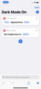
Quote from PeteRT on May 14, 2021, 03:04Hi PhilipMat
I use dark mode when navigating and light mode the rest of the time. To make this easy and quick I have programmed the two shortcut buttons which you will find in the top row of menu buttons screen.
Used iPhone shortcuts to do this.
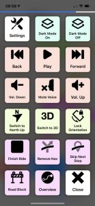
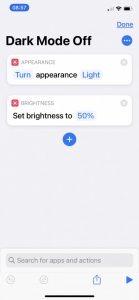
Also toggled the screen brightness with these shortcuts.
Hi PhilipMat
I use dark mode when navigating and light mode the rest of the time. To make this easy and quick I have programmed the two shortcut buttons which you will find in the top row of menu buttons screen.
Used iPhone shortcuts to do this.
Also toggled the screen brightness with these shortcuts.
Quote from PhilipMat on May 14, 2021, 08:38Peter, that is absolutely brilliant! Thank you Guido for including those two shortcut buttons
Peter, that is absolutely brilliant! Thank you Guido for including those two shortcut buttons
Quote from johansw on May 22, 2021, 05:08Quote from PeteRT on May 14, 2021, 03:04Hi PhilipMat
I use dark mode when navigating and light mode the rest of the time. To make this easy and quick I have programmed the two shortcut buttons which you will find in the top row of menu buttons screen.
Used iPhone shortcuts to do this.
Also toggled the screen brightness with these shortcuts.
Hello PeterT. I tried changing from High Contrast regular to High Contrast Dark - what a differece in detail!!
Now my question is if you briefly could tell me the steps how you went about to program the shortcuts to switch between the two modes...
Hope it is not too much to ask
Johan
Quote from PeteRT on May 14, 2021, 03:04Hi PhilipMat
I use dark mode when navigating and light mode the rest of the time. To make this easy and quick I have programmed the two shortcut buttons which you will find in the top row of menu buttons screen.
Used iPhone shortcuts to do this.
Also toggled the screen brightness with these shortcuts.
Hello PeterT. I tried changing from High Contrast regular to High Contrast Dark - what a differece in detail!!
Now my question is if you briefly could tell me the steps how you went about to program the shortcuts to switch between the two modes...
Hope it is not too much to ask
Johan