
Due to site maintenance, Forum interaction has been disabled until August 13. For support, please search existing forum posts or check the support page.
You need to log in to create posts and topics.
Some usability thoughts
rocminc99al@rocminc99al
14 Posts
Member
#1 · July 17, 2021, 22:35
Quote from rocminc99al on July 17, 2021, 22:35I don't know if v3 will have a different navigation panel. But if not, here are some thoughts after driving with the app:
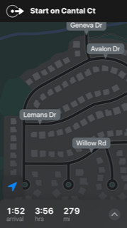
- Speed limit is probably not the most important piece of information. Does it need to be in in a big, fat, red circle? I found it distracting.
- Arrival time, time to destination, and distance to destination use more space than necessary. I think am/pm, mi, hr/min could be in really small font below the numbers (similar to how it's implemented in Apple Maps.) When I ride my bike, if I don't know if it's AM or PM, I have a bigger problem.
- I've noticed that Scenic sometimes shows multiple road names or numbers as a single text string that doesn't fit on two lines next to an arrow. It's not really readable. If I'm in Minneapolis and I'm getting on Hwy 35E, this is the only thing I need to know.
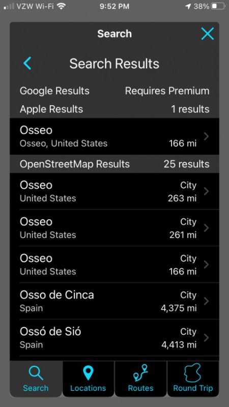
- When looking for a city, Scenic doesn't show the state. It's confusing.
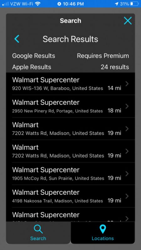
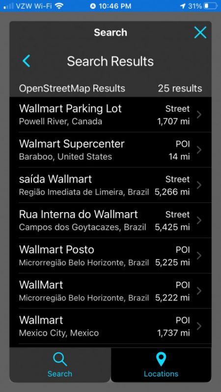
- When I tried to add a stop along the route, it was not clear what the distance number represented. Some entries from OSM, like a Walmart in Canada or Brazil, probably not necessary and could be filtered out.
- Scenic doesn't tell you if you need to take exit A or B from interstate.
I don't know if v3 will have a different navigation panel. But if not, here are some thoughts after driving with the app:
- Speed limit is probably not the most important piece of information. Does it need to be in in a big, fat, red circle? I found it distracting.
- Arrival time, time to destination, and distance to destination use more space than necessary. I think am/pm, mi, hr/min could be in really small font below the numbers (similar to how it's implemented in Apple Maps.) When I ride my bike, if I don't know if it's AM or PM, I have a bigger problem.
- I've noticed that Scenic sometimes shows multiple road names or numbers as a single text string that doesn't fit on two lines next to an arrow. It's not really readable. If I'm in Minneapolis and I'm getting on Hwy 35E, this is the only thing I need to know.
- When looking for a city, Scenic doesn't show the state. It's confusing.
- When I tried to add a stop along the route, it was not clear what the distance number represented. Some entries from OSM, like a Walmart in Canada or Brazil, probably not necessary and could be filtered out.
- Scenic doesn't tell you if you need to take exit A or B from interstate.
Last edited on July 18, 2021, 08:01 by rocminc99al